This blog is made to track my progress of creating my AS media product of a rock magazine.
Friday, 16 December 2016
Final Rough Draft DPS
this is my final draft of my DPS and the only thing I changed is the title and the font colour of the seconf paragraph to make it match to colours of the rest of the magazine.
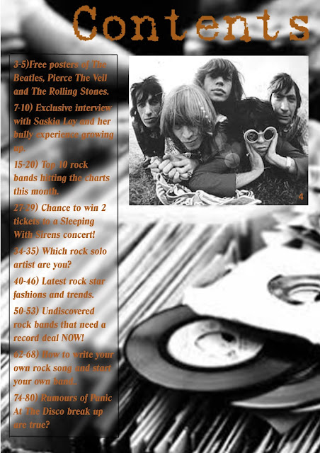
Final Rough Draft Contents
This is my final draft of the contents page where I made it more like a real contents page by making the font the same colour as the font on the cover so they match and added more topics in.
Final Rough Draft Cover
This is my updated and final draft of which I used feedback from the previous draft to make this one more likeable to my target audience. I added more headings and added the full name of the magazine.
Tuesday, 6 December 2016
Photoshoot Organisation Plan
Props
·
Electric
guitar
·
Acoustic
guitar
·
2 giant
speakers
·
10 plain
discs
·
20
records
·
Microphone
·
Teddy
bear
Locations
·
Bedroom
·
Stairway
·
Park
·
Skate park
Models
·
Rebecca Robertson
(female, blonde, 16 years old)
·
Saskia
Lay (female, purple, 16 years old)
·
Kiera
Corr (female, brunette, 16 years old)
·
Danielle
Horn (female, pink, 17 years old)
·
Jaymes
Lilly (male, dark blonde, 17 years old)
Make-up Artist
·
Caitlin Renwick-
Hair stylist
·
Lucy
Barton- Make-up
I did this in order to check off everything when it comes to my actual photo-shoot on the 10th of December. This way I know what I have to do and What I have left to do so I don't miss anything out and will get a large range of images.
Audience Feedback Of Digital Mock Up
This is my prezi do explore audiences feedback on my digital mock ups of the cover, contents and DPS pages. I then took from the feedback what I need to change for my first drafts and added it to the prezi. I did this as my audience is the most important thing to think about when producing my magazine as they are the ones that would potentially buy it if it were an actual product. I found that some things really worked for some members of my audience but not for others, therefore I put the most common comments onto my presentation because it is more important to please a majority of my audience rather than a select few.
Monday, 5 December 2016
Music Magazine Digital Mock Up DPS
Music Magazine Digital Mock Up Contents Page
This is my rough digital contents page mock up. I made this to see what layout works best and I found that text one side in a strip works best as it is clear and allows room for images the other side. I also explored the use of the colour orange to add some colour and quirk to the page but still be clear to read and understand.
Music Magazine Digital Mock Up Cover
This is my rough digital draft of my rock magazine. I did this in order to see how I want to lay out my cover and see what colours work together. I wanted to minimalize the amount of content on the page as I didn't want it looking clustered or messy. I stuck to a black and white image as it works well with my genre of rock and it allows me to experiment more with font colours.
Subscribe to:
Comments (Atom)


